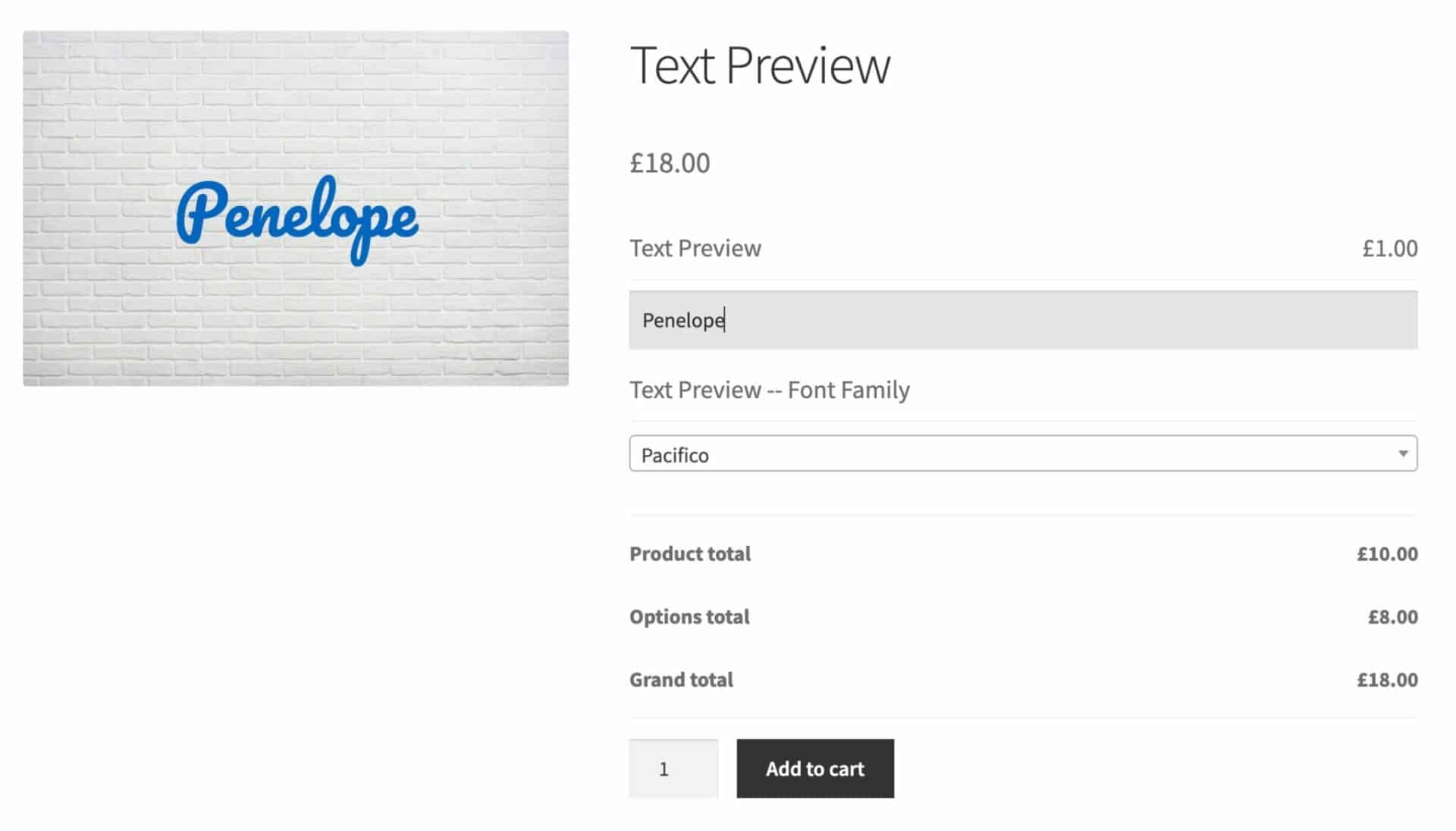
The Text Preview extension for Add-Ons Ultimate allows you to display your user’s inputted text over the main product image.
In the example below, you can see that there’s a text field on the right where the user has entered some text. This text is replicated over the product image on the left.
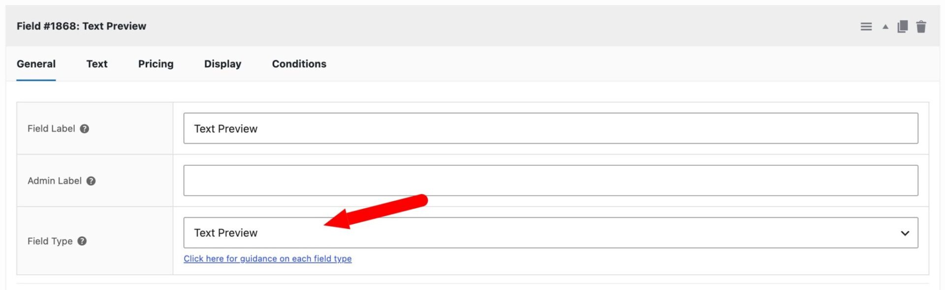
Text Preview field settings
Text Preview has a specific field type. So your first step is to create a new add-ons field and choose ‘Text Preview’ as the field type.
The Text Preview field type has all the parameters that a standard text field has, including minimum and maximum number of characters, free characters, etc. Access them by clicking on the ‘Text’ tab.
It also has a number of additional features, shown below:
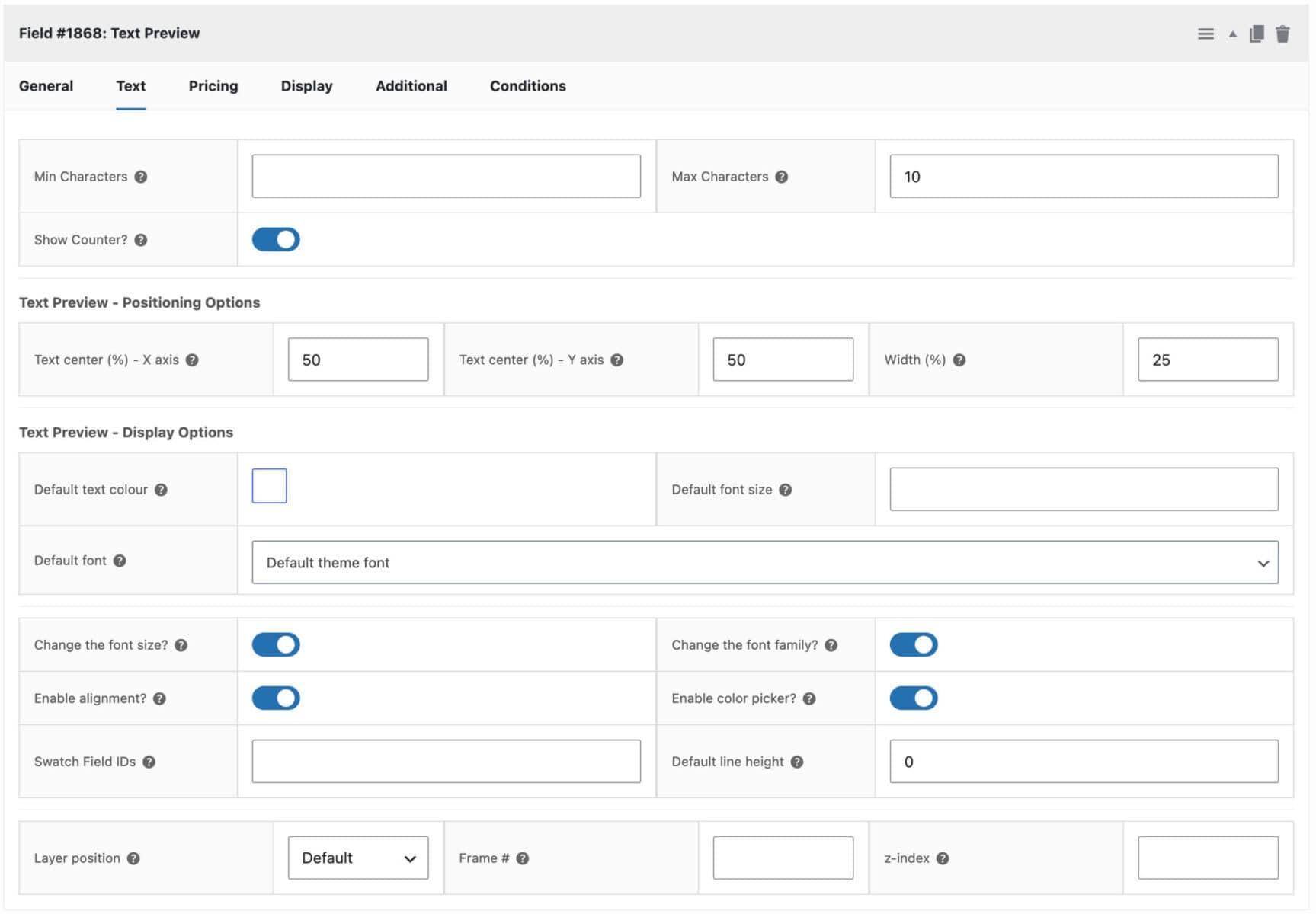
Text center – X axis
This setting determines how far left or right the centre of the text will sit relative to the main product image. If you enter 0 here, the centre of the text will appear on the left side of the image; 50 will position the text exactly in the horizontal centre of the image.
Text center – Y axis
This setting determines the text’s vertical position relative to the main product image. A value of 0 will position the text at the top of the image; 50 will be the vertical middle; and 100 will be the bottom of the image.
Width
This determines how wide the text field is relative to the image size – 100 would mean the text field was the same width as the main image.
Default text colour
You can set the default preview text colour here.
Default font size
Use this to set the preview text’s default font size in pixels.
Default font
Choose the font to use for the preview text. You can select from the default theme font, Google Fonts, or any custom fonts you have added.
Default line height
Set a default line height for the preview text, expressed as a percentage of the original line height. Leave this field blank if you do not want customers to be able to adjust the line height.
Customers can change the color?
If you select this option, the user will be able to use a color picker to set the preview text color.
Customers can change the font size?
Enable this option to allow the user to change the font size of the preview text.
Customers can change the font family?
Enable this option to allow the user to choose the font to use in the preview text.
Enable alignment?
Enable this option to allow customers to choose the text alignment for their preview text. When enabled, customers will see alignment controls (left, center, right) on the product page.
Swatch Field IDs
Enter the ID(s) of any swatch fields on the same product that should update the colour of this text preview. This allows a color swatch selection to automatically change the preview text colour. Separate multiple IDs with commas.
Layer position
By default, the plugin will display the text preview on all product images in the product image gallery. However, you can limit where it’s displayed using this setting. Choose from Default, First Frame, Last Frame, or Specific Frame #.
Frame #
If you choose Specific Frame # in the Layer position setting, you can specify which image you want the preview to display on here.
z-index
Optionally set a z-index value for the text preview layer here. A layer with a greater z-index is displayed in front of layers with a lower z-index.
Text Preview global settings
As well as settings for each text preview field, you can set some global options in WooCommerce > Settings > Product Add-Ons > Text Preview.
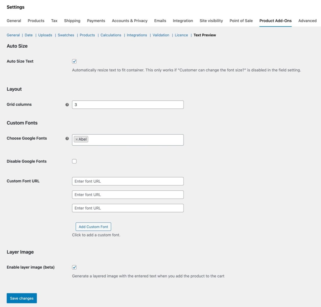
Auto Size Text
Enable this option to dynamically resize the font size of preview text according to the size of the preview area. So if a user enters more characters than will fit the preview area at the default font size, the font size will scale down automatically. Note that you should have the ‘Customers can change the font size?’ field setting disabled.
Grid Columns
If your fields have additional options on the front end for font size etc, you can choose to display these in columns rather than on separate rows.
Choose Google Fonts
Choose specific Google Fonts to offer your customers instead of displaying the full list of all available Google Fonts. If left empty, all Google Fonts will be available. This is useful for keeping the font picker focused on fonts that match your store’s branding.
Disable Google Fonts
Enable this option to remove Google Fonts entirely from the font picker. Use this if you only want to offer the default theme font or custom fonts that you have added via the Custom Font URL setting.
Custom Fonts
Add URLs to custom font files to make them available in the font picker. Click Add Custom Font to add additional URLs.
For working with custom fonts, see this article.
Enable Layer Image
Enable this option if you would like to generate a composite of the main product image and text preview fields.