WooCommerce Variation Swatches allows you to replace the standard variation dropdown lists with swatches or buttons.
General settings
For the general settings, go to WooCommerce > Settings > Variation Swatches
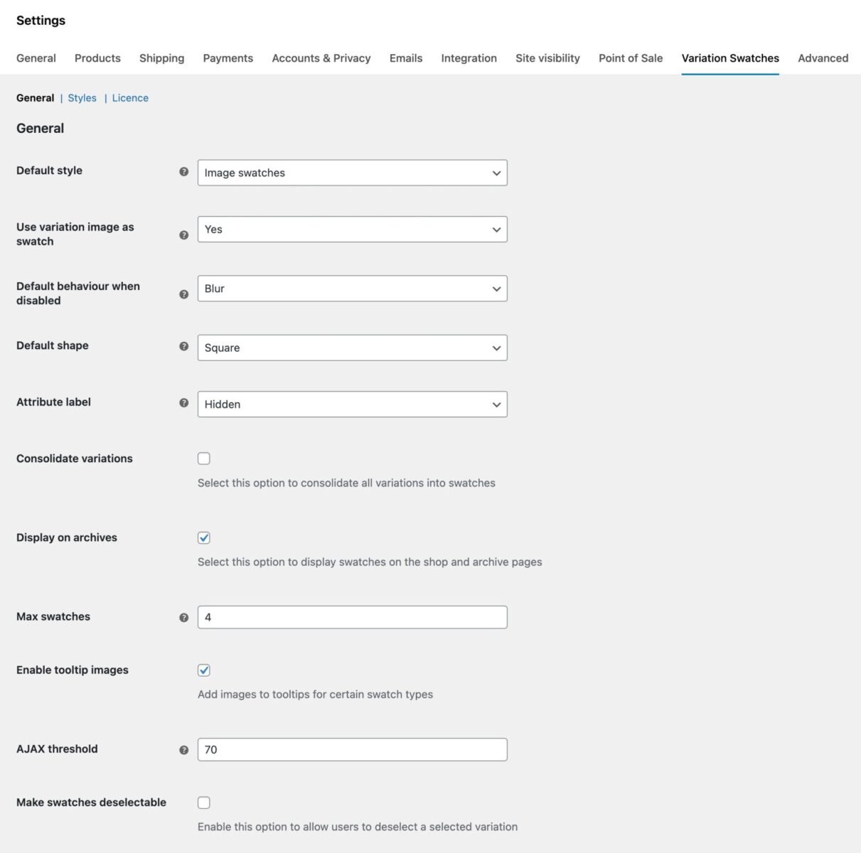
Default style
You can use this setting to apply a new style to all variation dropdowns in your site. Choose from:
- Dropdowns (these are the default variation dropdown fields)
- Color swatches
- Image swatches
- Radio buttons
- Text swatches (buttons)
This setting can be overridden for specific attributes and products.
Use variation image as swatch
This option will only be enabled if you choose ‘Image swatches’ as the ‘Default style’. Choose ‘Yes’ here to automatically use existing variation images as swatches.
Default behaviour when disabled
Use this setting to define how any out-of-stock variations are displayed. Choose from:
- Disabled
- Blur
- Cross
- Fade
- Hide
This setting can be overridden for specific attributes and products.
Default shape
Choose the default shape for swatches from the following options:
- Circle
- Rounded
- Square
This setting can be overridden for specific attributes and products.
Attribute label
Use this setting to define how the atrribute labels are displayed. Choose from:
- Block – labels will appear above the swatches
- Inline – labels will appear on the same row as the swatches
- Hidden – labels will be hidden
This setting can be overridden for specific attributes and products.
Consolidate variations
This option allows you to consolidate variations with multiple attributes into single swatches. So instead of having a dropdown for Attribute 1 and a dropdown for Attribute 2, the plugin uses the featured image of each variation and creates a unique swatch per variation.
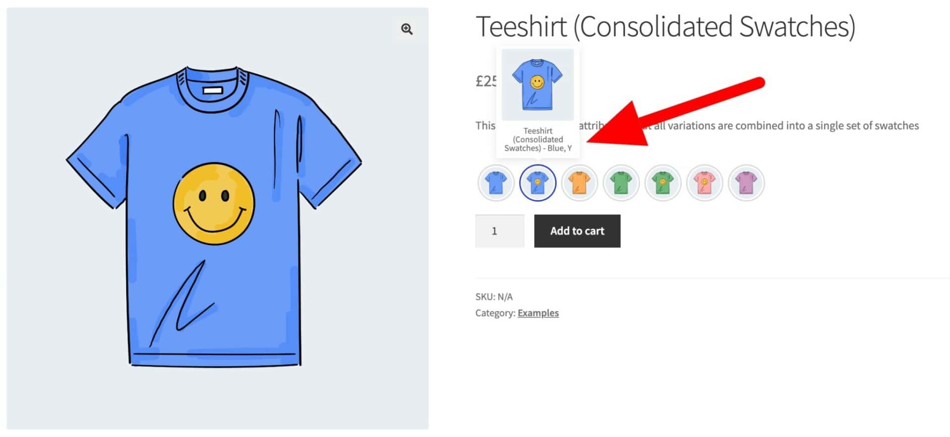
This setting can be overridden at individual product level. Just click the ‘Variations’ tab on the ‘Product data’ section.
Display on archives
Enable this setting to display your variation swatches on the shop and archive pages.
Max swatches
If you have ‘Display on archives’ set, you can define how many swatches to display on the archive/shop pages (for example, if you want to avoid them running on to multiple lines).
Enable tooltip images
Select this option to display an image in the tooltip. Works for color and image swatches.
AJAX threshold
If you have products with more than 30 variations, increase the value here to match.
Style settings
To access the style settings, go to WooCommerce > Settings > Variation Swatches > S
Sizes
- Image size – you can choose a preset media size to display your image swatches
- Image width – if you choose a custom image size, enter its width here in pixels
- Image height – enter the custom image height here in pixels
- Text/color swatch height – define the height of your color and text swatches
- Text swatch padding – define the left/right padding for your text swatches
Image and color swatch colors
- Border color – pick the default border color for your swatches
- Border highlighted – pick the border color when a swatch is selected by the user
Text swatch colors
- Border – the default text swatch border
- Background – default text swatch background color
- Text – default text swatch color
- Border highlighted – the text swatch border color when selected by the user
- Background highlighted – the text swatch background color when selected by the user
- Text highlighted – the text swatch text color when selected by the user
Borders
- Image/color swatch border width – the thickness of the border for image and color swatches
- Text swatch border width – the thickness of text swatch borders
- Rounded border radius – set the border radius for rounded swatches
Radio buttons
- Enabled styled buttons – check this option to use a styled version of standard radio buttons
- Radio button highlighted – choose the color for selected radio buttons
Attribute settings
You can set styles at attribute level that override your global settings. Go to Products > Attributes and click ‘Edit’ under the attribute you’d like to update.
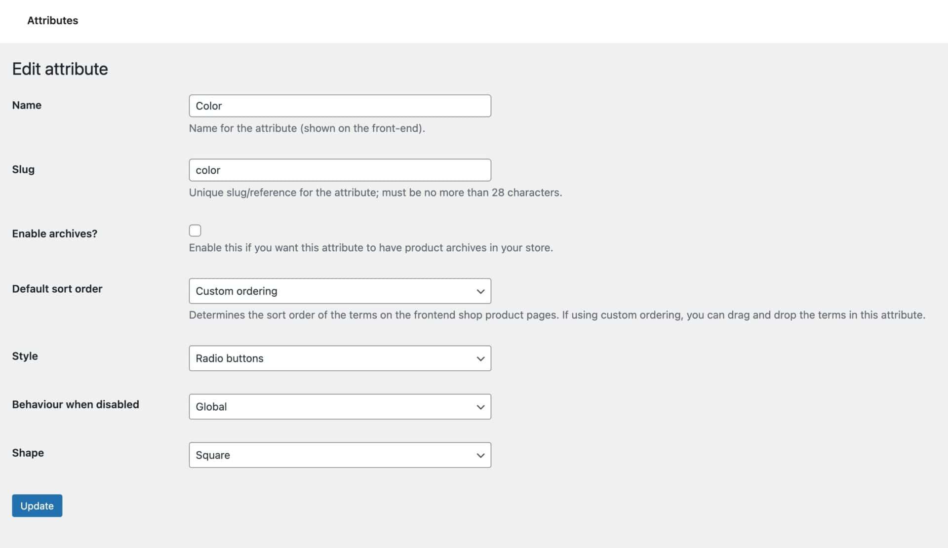
Style
By default, this will be set to ‘Global’ meaning that it will inherit the main setting. Change it to any one of:
- Dropdowns
- Color swatches
- Image swatches
- Radio buttons
- Text swatches (buttons)
This will apply just to this attribute. It can be overridden at individual product level.
Behaviour when disabled
Again, this is set to ‘Global’ by default. Update it to one of:
- Disabled
- Blur
- Cross
- Fade
- Hide
This can be overridden at product level.
Shape
Choose the shape for this attribute from:
- Circle
- Rounded
- Square
This can be overridden at product level.
Attribute term settings
Go to Products > Attributes and click ‘Configure terms’ under the attribute you’d like to update.

You can then edit each term, adding color references or image uploads. Click into the term you would like to edit.
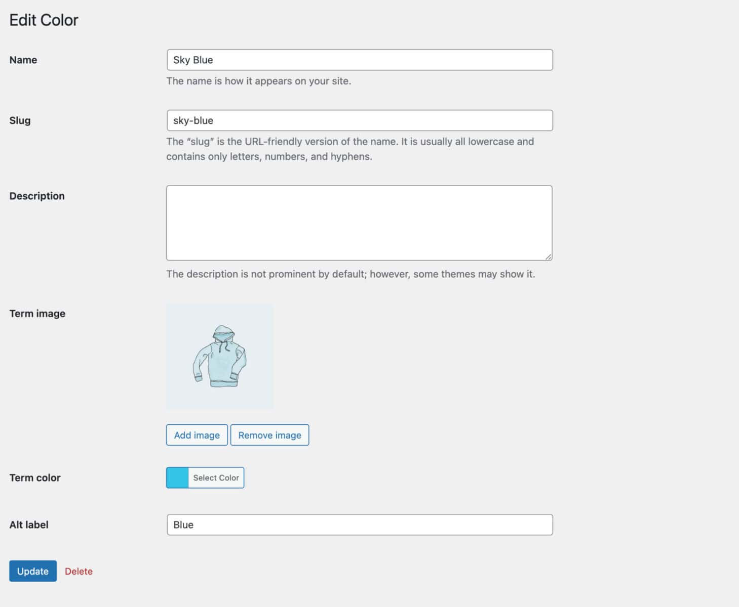
You can now upload an image for the term that would be used in any image swatches. And you can assign a color for color swatches. You can also provide an alternative label for the front end using the ‘Alt label’ field.
Product level settings
Finally, if you wish, you can have different settings for your swatches for each product. Click into the product you wish to edit and select the ‘Attributes’ tab in the ‘Product data’ section. Expand the attribute to edit it.
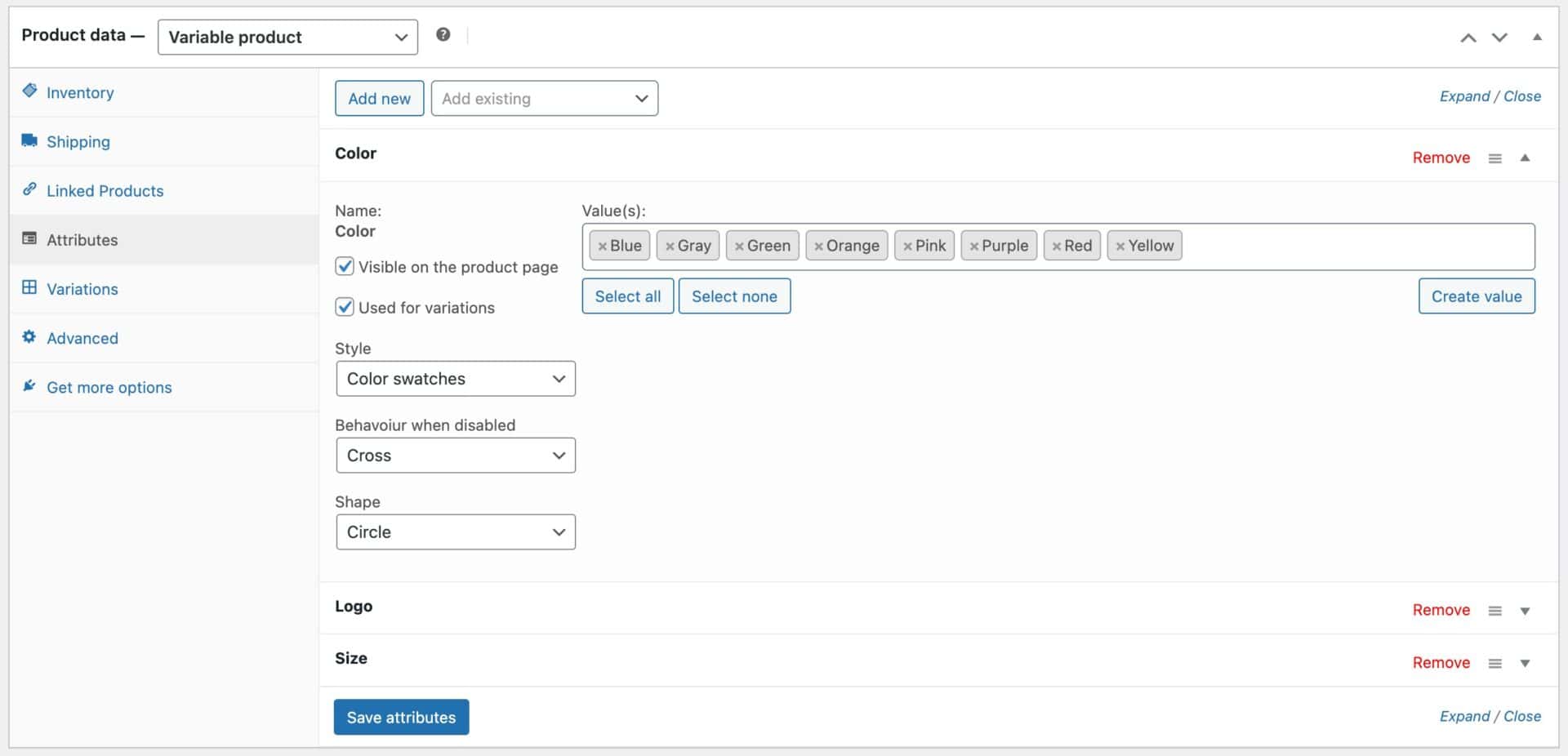
You’ll see the following options:
- Style
- Behaviour when disabled
- Shape
By default, these will inherit the global setting – but you can update them to whatever you wish just for the specific product.
Click ‘Save attributes’ to update your settings.